According to the “2022 Top 100 Influential KOLs Data Insights Report in Taiwan,” spearheaded by KOL Radar and DIGITIMES, Instagram has emerged as the favourite social media platform among Gen Z. To capture the young hearts of this demographic, brands must surely invest efforts into cultivating a strong presence on Instagram.
Once you’ve successfully attracted potential consumers to visit your Instagram account, how can your layout and design entice and convert them into followers? In this article, KOL Radar showcases our key insights and design resources for brands to create an official Instagram account that not only captures the attention of visitors but also retains and engages followers effectively.
Basic Techniques for Instagram Layout Design
Setting Up a Brand Account Style
Different types of companies, offering a variety of products and services, necessitate distinct layout designs and styles on their official Instagram accounts to effectively showcase their offerings. Brands must consider both current and future content when selecting templates, and designing the most suitable Instagram layout format. For instance, brands aiming to showcase their professional image through an Instagram account should ensure that the layout design, such as colour schemes, aligns with the brand’s overall corporate identity. On the other hand, accounts focusing on products should make sure that products are clearly visible in the thumbnail of each post. If a brand intends to create posts with more text, more attention should be given to the positioning of the text within the thumbnail, as well as its alignment with accompanying illustrations.
Choosing an Instagram Profile Picture
Profile pictures have a significant impact on the first impression made by a brand’s account. When designing the profile picture, brands may opt to directly use their logo or design a custom avatar based on their brand colours. Several key factors play an important role to effectively create a strong first impression through the profile picture, including high image quality, recognizability, and alignment with future brand direction.
Clear and Concise Account Information
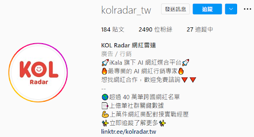
When a visitor becomes interested in an Instagram official account, they often turn to the profile’s top section, where the personal bio is located, for further information. As a result, the personal bio is crucial for optimising a brand’s Instagram layout design. KOL Radar suggests that brands can present brief points about their brand’s mission, core values, or official website links. To avoid an overwhelming amount of text that may deter reading, brands can use #Hashtag labels to highlight key points. This makes it easy for visitors to quickly grasp the content, while also enhancing the algorithm’s exposure of the account through improved visibility!
Curating Featured Instagram Stories
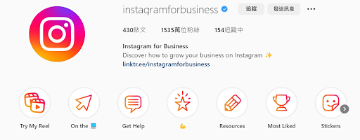
There are many benefits for brands to leverage the “Featured Stories” feature to categorise and showcase important temporary content. It enriches your brand account’s content by allowing visitors to gain deeper insights into your brand through the curation of themes parked under featured stories. When creating cover images for your featured stories, look into designing thumbnails that align with your brand’s visual identity. This results in a seamless and captivating Instagram page that is aligned with your brand. Looking for more inspiration? Search for “Story Highlights Covers” on Pinterest or refer to designs from other official accounts to develop your distinctive style for featured stories.
Designing Post Layout
The visual consistency of your brand’s Instagram post covers, particularly in the relative positioning of text and images, has a huge impact. Even minor differences are easily noticeable. To ensure that identical elements appear in the same position across various posts, brand account managers can utilise features like rulers and locking functions in the layout software.
Pay special attention, too, to design aspects such as text length and image size to ensure clarity and readability. Neglecting these factors can lead to visual fatigue among users, causing them to lose interest and engagement with the account.
Next, KOL Radar has compiled some key principles for designing Instagram post covers. This includes common layout design practices and frequently used Instagram layout design tools. We believe these insights will be highly beneficial for brands that are just beginning their journey in Instagram management.
Get Creative with Post Grids on Your Instagram Layout!
Nine/Twelve-Grid Creativity
As the name suggests, the nine- or twelve-grid layout involves dividing a single image into multiple posts and publishing them sequentially. This technique is visually captivating because it occupies a big portion of your account’s layout, quickly drawing the audience’s attention. Brands can also incorporate engaging role-playing games or puzzle-game concepts to avoid repetitive captions in each post, enhancing interaction and discussion among followers.
However, this layout can potentially lead to viewer fatigue, as the content might appear repetitive. Therefore, KOL Radar suggests using this layout sparingly and primarily during moments when suspense is necessary, such as unveiling significant milestones. Utilising this technique inappropriately or overusing it may lead to negative effects.
Three Template Strategy
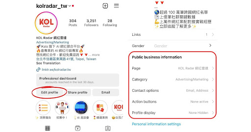
Capitalising on Instagram’s unique three-post-per-row layout, brands can consider adopting a three-template strategy, applying content to these templates in a continuous and sequential manner before publishing. KOL Radar has utilised this posting strategy for an extended period. Apart from designing a dedicated yellow template for “Social News Alerts,” the other two colour schemes create a sense of familiarity for followers who read multiple posts at once on the Instagram page. This approach enables them to discover the highlights across different types of posts.
For brands that use fixed templates, it’s essential to regularly fine-tune and refresh them to provide a sense of novelty for devoted followers.
Checkerboard Layout
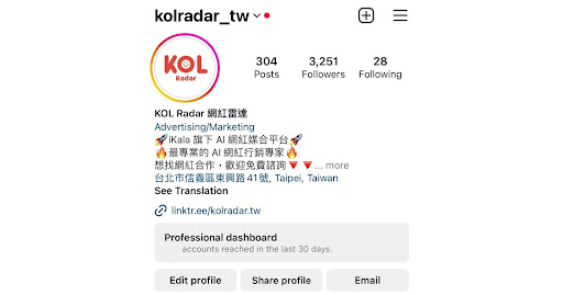
The checkerboard-style Instagram layout design involves the alternating use of two distinct templates for posting. The advantages of this layout are easy maintenance and visually appealing aesthetics. For instance, when a previous post needs to be taken down due to issues, there’s no need to archive an entire row of three posts; simply removing one post before or after will maintain the layout’s neat appearance. However, there’s a downside: the variation is limited, so prolonged use might lead to visual fatigue among users due to its consistent structure.
Layout Tool Compendium | All About Editing and Design
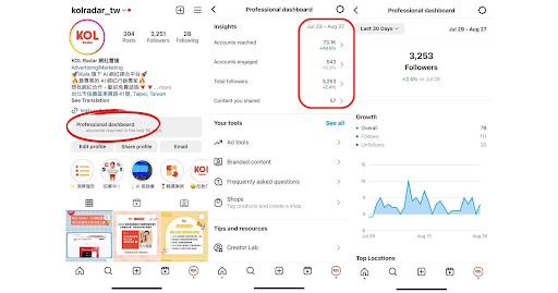
When managing a brand account, design bottlenecks are unavoidable. Running out of ideas for inspiring IG layout design? Turn to Pinterest for the rescue! From professional designers to enthusiasts, a variety of design templates are available, covering profile avatars, featured story covers, and post layouts. Pinterest serves as an excellent aid for layout designers, as the brand marketing team can browse a wide range of designs and ideas for crafting an appealing Instagram presence.
Canva
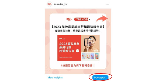
Canva is currently the hottest online design platform in town! Its user-friendly interface is a blessing for brand designers and editors who aren’t familiar with tools like Adobe Photoshop or Illustrator. Canva’s functions are on par with professional editing software, both in terms of professionalism and intricacy. Moreover, Canva’s extensive template library is a treasure trove. After selecting a suitable design and making minor adjustments, brand owners can achieve a unique and customised Instagram layout design that sets them apart.
VSCO
VSCO is an image colour correction software and app, with some features available through paid options. Before uploading images to your brand’s official Instagram account, you can use this software to make detailed adjustments to aspects like shadows, sharpness, colour temperature, and more. This ensures that the images you present to consumers align closely with your brand’s identity.
VSCO also provides a selection of ready-made filters that users can apply instantly, enabling the rapid creation of high-quality images. For brands that prefer authentic product photography, you can reference VSCO’s filter options to create content for your Instagram layout that resonates with your brand’s aesthetics.
Conclusion
Instagram layout design is crucial for creating a strong first impression on new visitors to your brand. From profile pictures to bios, featured stories, and post layouts, consistency is key. Both brands and creators need to ensure a cohesive visual identity on their Instagram account. Brand teams managing official Instagram accounts can make the most of the layout examples mentioned in this article and various practical tools.
By doing so, they can design a pleasant experience for visitors, leaving a positive imprint on potential followers and driving increased interactions. This approach has the potential to translate into more opportunities and conversions, thus driving your business forward!
Interested in unlocking influencer marketing strategies?
Feel free to reach out to KOL Radar for a friendly, no-obligation consultation! https://www.kolradar.com/en/.
▶︎ This article may not be reproduced, redistributed, publicly broadcasted, or publicly transmitted in any form. Copyrights and portrait rights of the images and data cited in this article remain with the original rights holders.
